
These days it is possible for anyone to be a web designer. Yes, it is a bold statement – but with an increased accessibility to open-source design software like Figma, and with DIY site building platforms like Wix, Squarespace and even Webflow flooding the market, the line between amateur and bona fide web designer has become much thinner and hazier as of late.
The interesting thing about creativity is that no one can decide for you when you are “ready” to fill a certain role. Plenty of rock stars never took music lessons; many successful artists never studied human anatomy; and the majority of web designers out there do not carry a formal degree. So, if you created your own business’s website, can you then confidently say you are a “web designer”? That’s for you to determine.
It is possible for anyone to be a web designer with DIY site building platforms.
If you’re a follower of this blog, then you’ve likely already made the decision to build your website yourself. While you may feel completely overwhelmed by the staggering amount of information there is to learn about web development, you can rest assured knowing that business owners with even very little design experience really can create websites that look professional. It all starts with following a few fundamentals that, if applied correctly, can go miles towards the credibility of your site’s design and user experience.
What This Guide Is (and What It Isn’t)
To be clear, we’re talking about the very basics of web design here—and won’t be going into more advanced topics like grid systems, JavaScript, or CSS frameworks. This guide also assumes you’re using some sort of drag and drop website builder so you can design a website without coding. Whether you’re using an existing template from your website builder or starting from scratch (a more ambitious option for beginners), this guide will help you with the basic web design principles and practices you should apply to your website. A single article on web design isn’t going to instantly turn you into an expert, so consider this your first step into a larger world.
The Basics of Web Design for Beginners
Let’s get down to it, shall we? Here are some of the most useful trends and guidelines to know when building your first website:
1. Put Away the Mouse, Pick Up a Pencil
Your website may already exist as a beautiful, complete entity in your mind—which is why you immediately jump into Photoshop (or worse, a browser and HTML) to plan it out. Whoa, whoa—cool your jets for a second! Don’t put the cart before the horse. First, get out a pencil and pad of paper and begin putting your ideas into something easily tangible. This is an important phase to map out the structure of your site using nothing more than rectangles, doodles and inspired ideas (often called wireframing). Things can be super rough at this point; no one’s going to see it but you.
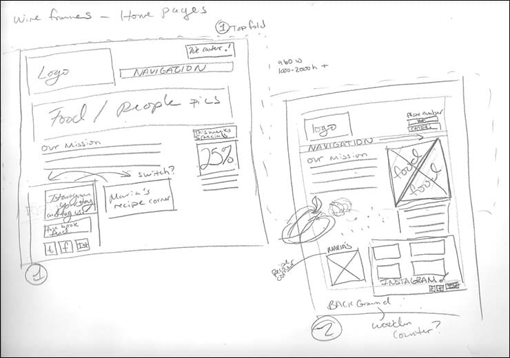 A website wireframe helps you develop a layout and structure for your website, while improving user experience (UX) and saving time.
It is far easier at this stage to alter layouts you originally thought would work but now discover are cluttered and confusing on paper. This will save you many hours of frustration as opposed to making the same discovery once the site is coded and in a browser. Plus, it helps significantly to build a web page when you have a reference in hand to consult rather than going in blind.
2. Follow a Hierarchy
It’s a fact that most web surfers tend to only scan web pages rather than take the time to actually read everything. You need to be ready for this by putting the most important content first. This means that a user should be able to digest the most vital information on a page all in one screen on initial load, without having to zoom or scroll. This is of course much easier said than done. Here are a few tips to help you better grasp the significance of this design theory:
Keep Content “Above the Fold”
We call that initial screen of loaded content “the fold”—and everything below it that must be scrolled to be seen is considered secondary. Generally, your most important information sits “above the fold”. The main thing to accomplish within this area is to entice a user to take action or generate the incentive to scroll down further.
Using a “Hero” Image
A common trend in web design nowadays is to fill this “above the fold” area with what is called a “hero” image or banner. These are full-screen background images with very succinct and to-the-point overlaid text, usually paired with a call-to-action button. Feasibly the entire purpose of the web page could be contained within this banner area, athough it also serves as a great primer for the content to follow.

“The Fold” May Change Depending on the Device
Here’s where things become complicated—and why you shouldn’t overburden yourself trying to fit everything above this magical line. Depending on the user’s device, the screen dimensions could vary tremendously. A jaw-dropping 5K display has a vertical resolution of 2880 pixels, whereas an iPhone 5 has less than half of this. This means that mobile users just aren’t going to be able to fit as much content into their screen real estate. (More on this later.)
3. Typography Is Your Design
Unless you’re running a photography business, text is the single most important element of any website, so it’s important to do this part right. Your web page’s hierarchy is greatly dependent on the typography you choose: how your headings, subheadings, and body text follow a natural flow and remain visually distinctive from one another. For a comprehensive look at typography, check out our guide of best practices. Here are some important takeaways:
- Make sure the text is legible (avoid flowery fonts!) and large enough (usually around 16px for the body).
- Stick to no more than two fonts—and make sure they pair well together!
- Give your paragraphs some room to breathe between each other, and set enough top padding or margin on your headings to signify clear breaks in content.
- Avoid long lines of text. It’s easier on the eyes for paragraph lines to be roughly no more than 15 words long—and a bit less than that for mobile screens.
- Serif fonts are typically best only in print—unless they are used in large headlines on the web.
4. Colors & Contrast Are Crucial
We’ve spoken about color psychology at length, but the concept bears repeating. The colors you choose for your website play an enormous role in how users perceive your brand, as well as how motivated they may feel in taking action (i.e.: buying things) through your website. Why? Well, every color evokes certain emotions, and either because of their inherent nature or by cultural conditioning, these colors have become associated with certain types of businesses. If a children’s toy company or a financial advisor painted their entire website in stark black, it would absolutely send the wrong signals to their intended audiences. On the flipside, a bright orange or a pleasant blue, respectively, would capture the perfect tone and awareness for their customers.
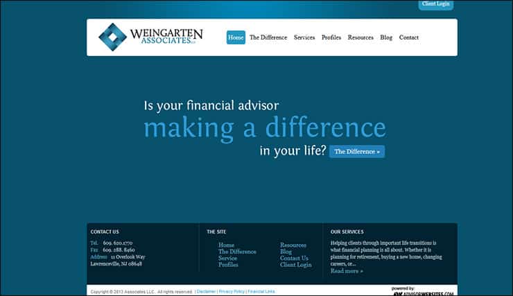 Blue is a color that evokes confidence and trust, a popular choice for finance-related websites.
If you’ve already established the colors of your brand, then use those on your website. It’s best, however, to keep it at no more than three colors for your site; like fonts, you don’t want to overdo it here or your site could end up with multiple personality disorder. Also be wary of too many splashes of color across your web page; our eyes are drawn to them like honey traps, and they could interrupt the natural flow of your content. Use color only when it is most needed, such as for links or buttons.
On the subject of contrast, it is essential that your text stands out from the background. Using light greys, yellows or greens for your fonts will almost certainly render them invisible on the page. Black on a white background is the greatest combination of contrast and is generally what you should stick to.
You also want your text to pop against background images. Using very busy photos can distract from the text, so to avoid this problem either use photos that are less detailed, or use an overlay of, say, rgba(51,51,51,0.5)to help soften the image underneath the text.
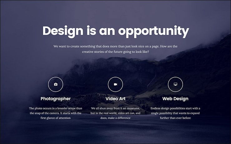 Use an overlay behind text to help it pop from the background.
Contrast also plays a role in how users are drawn to certain key elements of your site. Your most important call-to-action buttons must grab the eye through use of contrasting colors. A blue “Buy Now!” button loses its urgency and worth when it is swallowed by a site that uses blue everywhere—but a red button on that same page grabs a user’s attention by shouting “Hey! Click me!”
6. Using Pictures
Choosing the right images to use on your website partly comes down to your own artistic aptitude, but there are also intellectual considerations to take that should help with your selection process. Firstly, avoid embellishing your site with extraneous photos just because they may look nice. Instead, think of how each image you use serves its own purpose, and more importantly how it acts as content. A well-chosen photo can convey your brand, service, product, or audience much more effectively than words. Use photos to help your users understand something, to evoke emotion, or to inspire trust and confidence; using them purely for aesthetic reasons should be secondary.
Understanding File Types & Compression
There is an extra step that must be taken for using images on the web. Those fancy photos you obtain from sites like Shutterstock and iStock can be quite massive (5,000+ horizontal pixels and 10+ megabytes in size) which is fine for print, but they’re unfit for websites. Not everyone has superfast Fiber Internet, so you must reduce the size of your images to accommodate for loading times (not to mention 40% of visitors will leave if the site takes longer than 3 seconds to load!). Typically, you want to keep each of your images at a maximum of 500 kilobytes in size, though your average file size should probably be around 100 kilobytes.
- JPEG is the standard format for photos. It is a lossy format, which means its image quality is reduced when compressed. If you’re using a JPEG for a full-width background image then I recommend keeping its horizontal resolution at no less than 1200px. For general purposes, avoid using any image with less than 600px horizontal resolution, as it will likely appear blurry on modern screens.
- PNG is the preferred choice for graphics or for images that require transparency. It is a lossless format, which is great for retaining image quality but can also increase file sizes. Generally you’ll use PNG graphics for illustrations, icons, or smaller images that can be stacked on top of other elements because of their transparency. You’ll rarely need a PNG to be larger than 1000px.
- SVG (Scalable Vector Graphic) is a newer format that is replacing GIF and even PNG in some cases. The beauty of SVG is that it can be as large or as tiny onscreen as you need it to be, all while retaining perfect clarity and crispness (and still be a small file size). You should consider using SVG for any logo, icon, or vector graphic on your website; as high DPI displays are now becoming commonplace, the sharpness of SVG will provide the greatest image quality.

6. Mobile-First Design
We’ve now reached a time where most people consume online content with their phones rather than on a desktop computer. As a result, there is far greater precedence in web design to tailor specifically to the mobile experience, which has led to the “mobile-first” design philosophy.
Essentially this means that, during your initial sketching and planning phase on paper, it is best to focus first on the site’s mobile layout. Only the most important content necessary to the functioning of your site will be displayed on smaller screens. This forces you to simplify your layout and cut out any distracting elements right from the start. Think back to your “above the fold” content: if you first ensure that all the important information can fit on the initial screen of a phone, then you’ll know for certain it will fit on larger screens. Once you’ve nailed the essential mobile layout, then you can begin adding in embellishments or larger images for desktop screens.
Your mobile layout assumes a more vertical design that inspires scrolling, rather than the wide landscape of a desktop. If, say, your product page displays listings in a grid of 3 across on desktops, then usually your mobile layout will display them as just a single column.
Yes, this means that you basically need to create several layouts for each page of your website. Thankfully, any good website builder should provide responsive templates that adjust these layouts automatically so you’ll then only need to fine-tune them.
7. Keep Things Aligned
When elements seem sporadically laid across your site it is often due to an alignment issue. Imagine your web page on a sheet of graph paper. Separate it into even columns by drawing, for example, six straight lines. You now want to make sure that the left edges of your elements are distributed and aligned to only these six vertical lines.
8. Keep It Simple
It is often said that the best web design goes unnoticed; it is only poor design that calls attention to itself. As mentioned earlier, the most important aspect of any website is simply its text. If you can provide outstanding typography that is a joy to read, chances are you won’t need to do a whole lot more. Attempting to overdesign your site will just clutter and complicate things.
Are the box shadows necessary? The crazy, ornate patterns? The dozens of colors? Probably not.
9. Big Open Spaces
Your content needs room to breathe. White space is the prevailing design choice for modern websites: wide, open spaces of nothingness to pad areas between content. It’s a more enjoyable way to digest information, and it also encourages you to remove superfluous text and images to keep the site clean.
Conclusion
Web design can be a sprawling field of technology to learn, concepts to practice, languages to study, and artistry to master. Only with experience will all of these components begin to make sense, but you are already well on your way just by grasping the fundamentals of what makes a good website work. I hope that this guide serves as your launching-off point, and that it gives you the confidence to take your website into your own hands and build it the way that only a business owner knows best.
A designer is born!
The authors
Learn more about us

THE BEHIND THE SCENES OF THIS BLOG
This article has been written and researched following a precise methodology.
Our methodology