
Digital design is evolutionary.
Just like fashion, digital design has evolved alongside the Web. When bell-bottoms were swapped out for skinny jeans, 3D logos went flat. Remember the neon trend? Those loud colors quieted down into the modern minimalistic palettes you see today. Websites went from using the same cookie cutter layouts to developing their own unique geometric patterns.
Design is dominating the Web because functionality is now expected.
The next step is to entice users with your content and aesthetics. To do this, there are certain design rules you must abide by. Following them will keep your branding consistent and users engaged. When implemented correctly, these tips will not only capture your audience’s attention, but also increase your conversion rate.
Let’s start!
1. The Basics: Font Choice
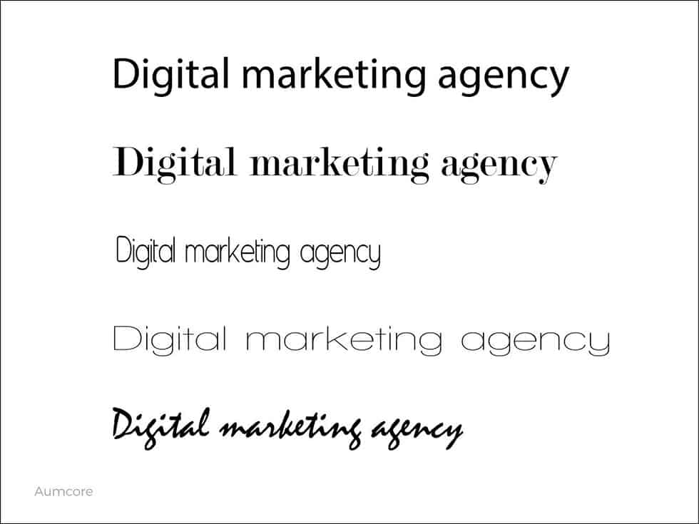
If you’re just beginning your journey as a digital designer, fair warning, determining fonts will either make or break your designs. Choosing the perfect font is like choosing the right tie for an interview – it takes some thought. The same way a tie brings an outfit to life, your font choice harmonizes your artwork and message.
When it comes to design basics, creating a font family consisting of three or four fonts is the generally accepted rule. You can, of course, include more if the design calls for it, but in order to keep your branding consistent, you’ll want a solid foundation to build off of.
Don’t forget to keep the medium of your work in mind. Will you be printing out a newsletter? Serif fonts ̶ fonts with the small embellished lines at the end of each letter ̶ are great for print, and some of the most popular Serif fonts are Caslon and Garamond. Is this purely for your social media channels? If so, Sans Serif fonts dominate the digital realm. You can read more on some of the trending fonts splashed across the web.
2. The Basics: Color Scheme
Make sure to keep up good relations with Mrs. Rainbow because without her, things can get pretty gray. As a designer, colors are your best friend. Understanding which colors go well together and which ones don’t is essential for a cohesive and well balanced design.
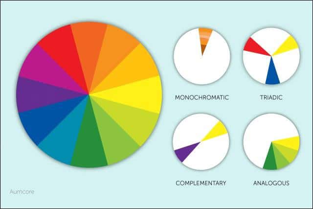
There are millions of places you can begin, but a safe starting point for any beginner is choosing colors from a monochromatic palette. This means keeping the same color while incrementally shading lighter or darker. If you want to stay in your comfort zone, try analogous or triadic color schemes. Looking at a color wheel, analogous colors are consecutive; they’re right next to one another. Triadic colors are the ones that form an equilateral triangle on the color wheel. For those who might have flunked geometry, this means three colors that are evenly spaced out forming a triangle on the color wheel.
If you feel like walking on the wild side, using a split complementary color scheme will give you another option. For this, choose a color, then choose the color directly opposite of it, and the two colors on either side. Those four colors will make up your split complementary color scheme!
Feeling up for a challenge? Take the next step and take a look into color theory. It suggests that different colors incite different emotions. For example, whereas warm colors like red and orange give off a sense of excitement and energy, cool colors like blue and green produce a calm and soothing effect. Color theory is especially popular in the food industry where, according to ConceptDrop, red and yellow area used to induce hunger. To drive conversion rates for your website, decide which colors fit your brand best and how you can effectively use their underlying tones.
3. The Basics: Hierarchy
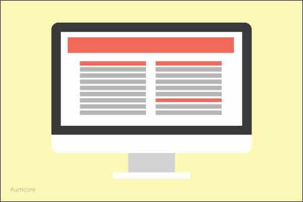
Creating a logical and well thought out hierarchy isn’t just a good design principle, it’s an SEO best practice. Users and search engines alike will reward a well laid out website with more visits. For Google, it’s all about whether or not they’re able to understand your site structure.
Think about what’s most important and order each item accordingly. The ideal structure for a website would be a pyramid with your homepage at the top, followed by a series of category pages. This outline can also be applied to every individual page. Start with the title, date, subtitle, and then follow up with copy.
4. The Basics: Proportion
Everything on your website should be proportionate. DO NOT stretch photos or type simply to fill space or achieve a specific aesthetic. Making photos a couple pixels wider or making font slightly taller to fill space is not the answer. It seems harmless at first, but stretching out photos causes a strain on the pixels, reducing its quality. Similarly, elongating or widening text distorts the letters and is often difficult to replicate with numerous lines. It’s also a poor design habit to get into, so save yourself and don’t fall into that pattern in the first place!
When using Adobe Illustrator or Adobe InDesign, be sure to use the respective ratio controls to keep your photos from skewing. In Illustrator, press down on the Shift key while adjusting your images. For InDesign, you’ll need to press down on the Shift key and Ctrl key simultaneously while adjusting your images to keep them proportionate.
Take the time to ensure that each item on your website is proportional to each other to achieve the look you’re going for. Websites with images or designs that are not proportional look amateurish and mediocre. Users brought up in the digital age have a higher standard and are faster to click out if they dislike something on a website. It may be slightly more work, but the end-result, a purposeful website, is well worth it!
QUICK FACT: Over 38% of your visitors will stop engaging with a website if the content/layout is unattractive.
5. Don’t Be Afraid to Go Negative!
Negative space isn’t empty space.
Cluttering too much information onto your homepage will overwhelm your users and, quite honestly, just looks bad. Use negative space to create a purposeful and meaningful design. Choose anything from your logo to a quote as your focus, and then leave the rest of the artboard as is. Allow that focal point to do all the talking for you.
6. A High Quality Image is Worth a Thousand Users
With smartphone cameras equivalent to DSLRs, there’s no excuse for a poor quality photo, especially if you’re trying to market a product for your eCommerce site. All of your images need to be high quality. Make sure to curate your images carefully because photography is usually taken as a fact, and your online pictures are the closest thing users have to seeing your products in person.
Be mindful of the background and lighting in your pictures too. Is there a color hue you need to edit? Does the image need to be cropped? These are all photo design elements that need to be taken into consideration. Draw users into your products by taking a page out of Sophia Amoruso’s book, #Girlboss, and create images that show off your product’s silhouette. Take your business and go from e-bay to Silicon Valley by uploading high quality imagery.
7. Make Your Call-to-Action Apparent & Psychological Triggers
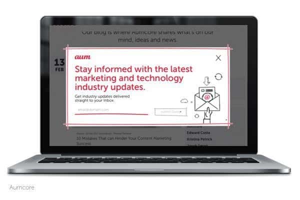
Don’t play tricks on your users – make sure they know exactly what you’re asking of them and what you want them to do. Design your home page with a specific purpose in mind and welcome your users with a single call-to-action. In addition and specific to the eCommerce industry, make sure that your “buy now”, “checkout here” or “sale” keywords are all noticeable and apparent. Adding an element of urgency will also help drive users to action.
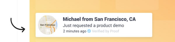 UseProof.com is a powerful service that reinforces social proof and is known to increase sales by average of 10%.
8. Simplify the Process
Running an eCommerce site means that you want users to make purchases. Let them do exactly that and don’t over complicate the process with a bunch of unnecessary tabs!
The more times they have to hit the back button (or look for the cart icon) to go where they want, the more chances they’ll simply give up and drop the process altogether.
Keep it simple and go for a one-step process. More importantly, allow them to check their cart in one to two simple steps. Don’t give your shoppers an excuse to leave! Drive your conversion rates by simplifying the checkout process.
9. No Surprises
Be upfront and straightforward about what your users can expect in your website. Avoid hidden costs or fees that popup during your customer’s checkout process. In order for your users to complete your CTA’s, they need to understand and see a clear path to completion. Make their path clear and don’t surprise them at the checkout.
QUICK FACT: Over 28% of users will abandon their cart if they’re met with unexpected shipping costs, and 23% of users will abandon their cart if they have to make a new account.
10. Customer Experience is the New User Experience
Create a section in your website where shoppers can go to stay updated and informed. This will give users a specific place they can go to for all their personal inquiries. If you’re selling clothes, what’s your return policy? Does your brand have any new coupons? What if the item they received was defective?
This is important for driving your conversions because it speaks to your customer satisfaction. Creating an FAQ section or something similar will also allow you to be accessible even after your customer service reps have signed off for the day. According to HelpScout, consumers found that customer service agents were unable to find the answers to their questions 50% of the time! On top of that, 82% of customers have left a company because of bad customer experience. Integrate this critical factor into your digital design to show your consumers they come first!
Conclusion
These 10 design tips are all good principles to follow throughout your digital career. From the basics to more complex design decisions, these choices should be made purposefully. Keep your eye on the aesthetics and watch your conversion rate rise!
To recap, here’s a second look:
- The Basics: Font Choice
- The Basics: Color Scheme
- The Basics: Proportion
- The Basics: Hierarchy
- Don’t be afraid to go negative! (When it comes to design at least)
- A high quality photo is worth a thousand users
- Make your call to action apparent!
- Simplify the checkout process
- Be honest with your users about what they’re dealing with, no surprises!
- Customer experience and digital design go hand in hand
Good luck and design on!
The authors
Learn more about us

THE BEHIND THE SCENES OF THIS BLOG
This article has been written and researched following a precise methodology.
Our methodology